That may be changing, because earlier this month the 55-member African Union endorsed the campaign, making it a diplomatic issue as well. The claim is that the traditional Mercator map of the world shows the African continent as hardly any bigger than Europe, whereas in reality it is at least four times as big.
That’s all very well, and it’s true that Mercator’s map projection dates from the 16th century, when European ocean-going ships were expanding and transforming everybody’s view of the world. But it’s also true that all flat maps distort the surface of a sphere (like the Earth) one way or another. Choose your poison, but you can’t have it all.
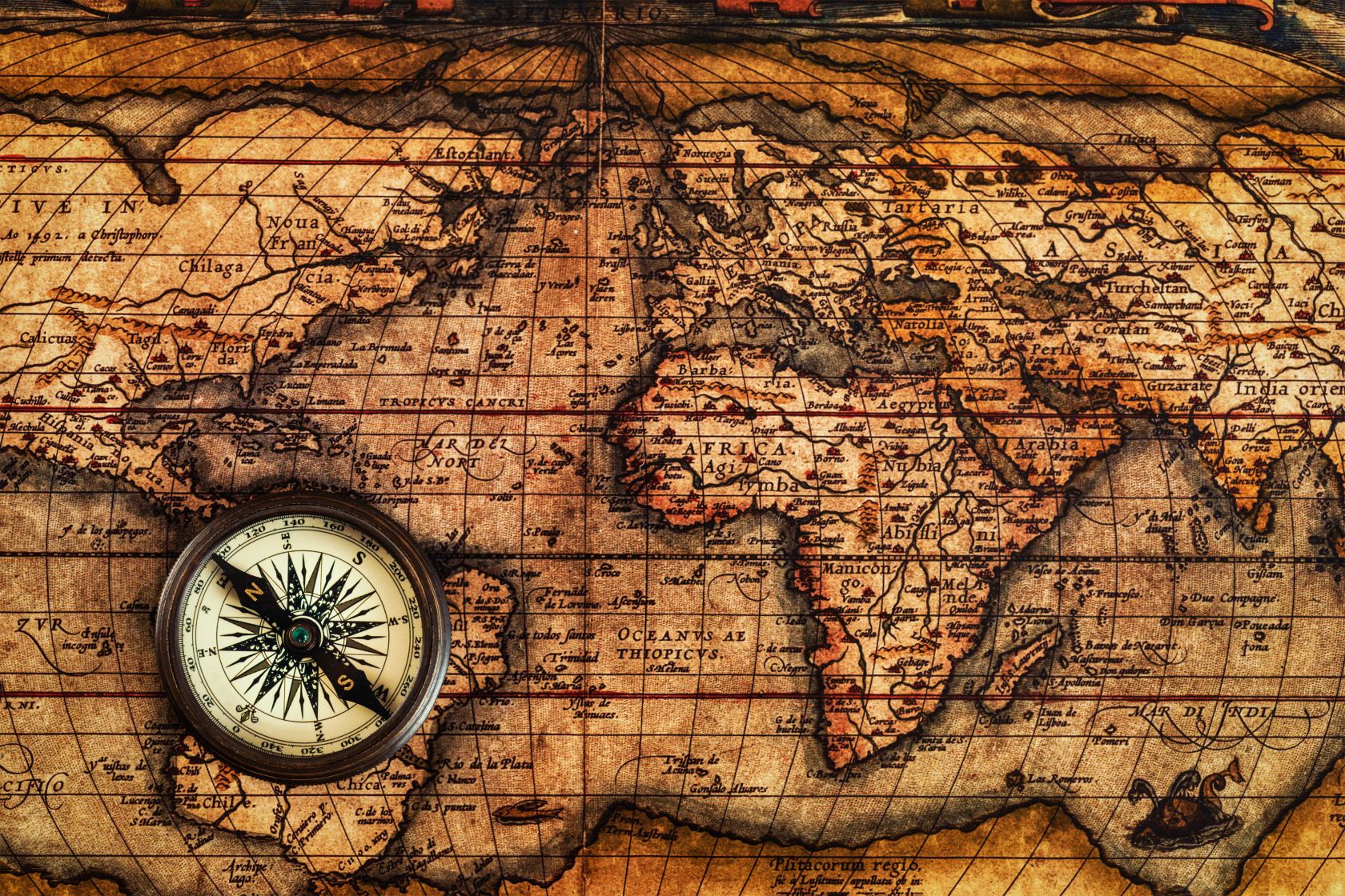
Go with the Mercator map and all the continents and islands retain their real shapes – but the further north or south of the equator they are, the bigger they look compared countries near the equator. You can fit fourteen Africas into Greenland.
Go with the ‘equal areas’ map (designed in 2018), and it’s the actual shape of the continents that is distorted – but you do get a clear idea of how big they are compared to each other. Horses for courses, you might say, and you can easily see why contemporary Africans would prefer the ‘Equal Areas’ map: it makes them look more important.
But there was a good reason for the Mercator map too. It wasn’t to make Africa look small and insignificant, as some paranoid ‘anti-colonial’ rhetoric alleges. It was because if you drew a straight east-west line on a Mercator map, it would lead your ship safely to its destination (barring hurricanes, pirates and mutiny).
Early mariners had no way to figure out how far east or west they were (longitude), but as long as they could see the Sun or the Moon they could figure out how far north or south they were (latitude).
They would therefore sail east or west along the line of latitude that passed through their destination, guessing how close they were to it by keeping track of their speed (throw a log over the side and see how fast you pass it) and hoping they would not reach the coast in the dark in the middle of a storm.
That’s what the Mercator projection was for. Nobody cared how big or small the destination looked on the map; they just needed to know what the right latitude was. All of that is irrelevant to modern navigation, so people can now safely fiddle with the size or shape of countries on the map according to taste.
If Africans want their kids to feel more important, there’s no harm whatever in using Equal Area maps on the classroom walls in those countries. If Canadian kids get a warm glow of pride in how big their country looks on the Mercator map, that’s okay too. It’s a local option issue everywhere.
“By correcting the map, we aim to shift perceptions and highlight the true scale, power, and potential of the African continent,” it says on the ‘Speak Up Africa’ website, and good luck to them with that. Unfortunately, the potential of the African continent right now is mostly on the downside.
Africa’s population reached one billion in 2008. It is already 1.5 billion, and it is going up at a steady 35 million a year. Even on optimistic estimates about how fast the birthrate drops (it is currently not dropping at all) the continent will reach three billion people within fifty years – and by the end of the century half of the people born on the planet each year will be African.
This would be problematic from the environmental point of view even if they were all healthy, wealthy and happy, but none of those outcomes seems very likely at the moment. African economies have grown slowly over the past fifty years, but population growth has meant that real per capita incomes in most African countries have scarcely risen at all.
African average incomes were higher than those in South and Southeast Asia in the 1950s, but they were already lower than those on any other continent by half a century ago and the gap just opens wider with the passage of time.
There’s no room here to debate why this should be the case, but the first step in changing it would be to acknowledge ruthlessly that it is so. Changing the maps is not enough.


